 Foto: Pexels
Logos are more than just pretty pictures—they often conceal subtle details that tell a lot more about the brand than you might think. Here are 10 classic examples of brands that hide extra stories in their design:
Toblerone

Toblerone’s mountain motif is iconic, but take another look: Hidden within the mountain is a bear. It’s a tribute to Bern, Switzerland—”the city of the bear”—where Toblerone was created.
![]()
Read also:
Amazon

Den smilende pil under Amazon-navnet gør mere end bare at vise glæde. Den går fra A til Z, og signalerer, at Amazon sælger alt mellem de to bogstaver. Smart og subtil branding på samme tid.
Tour de France
The smiling arrow beneath the Amazon name does more than just convey joy. It stretches from A to Z, signaling that Amazon sells everything from A to Z. It’s a clever and subtle piece of branding.
Beats
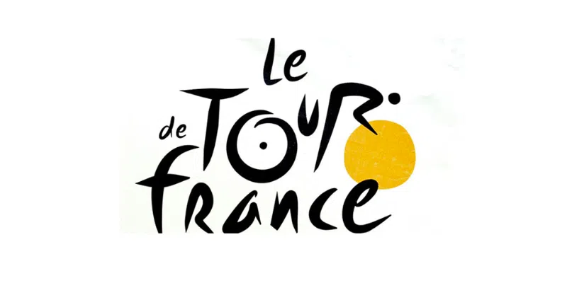
The Tour de France logo is a small stroke of genius: If you look closely, the letters “O,” “U,” and “R” form a cyclist on a bike, with the yellow circle becoming the front wheel. It’s a perfect blend of sport and graphics.
Audi
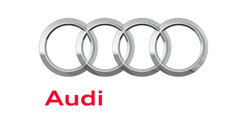
The four interlocking rings in Audi’s logo are not just decorative. They symbolize the merger of four automakers—Audi, DKW, Horch, and Wanderer—who joined forces in 1932 to form Auto Union.
BMW
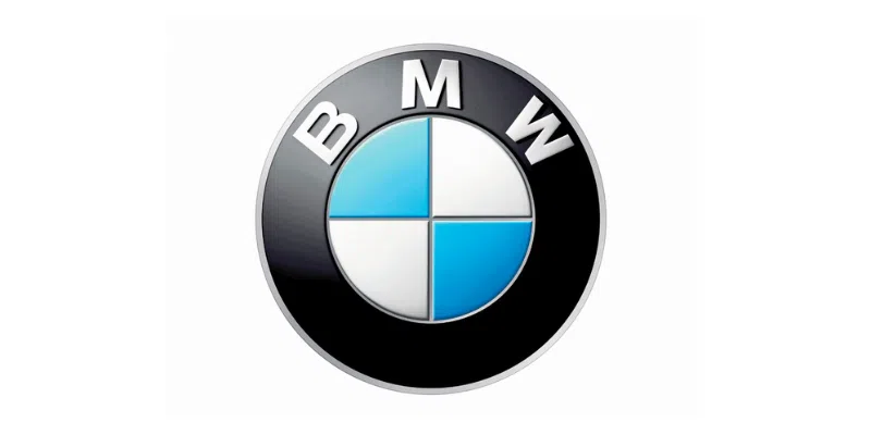
BMW’s logo, with its blue and white disc, is often said to resemble a propeller (which makes sense, as they once made aircraft engines). However, the colors actually originate from the flag of Bavaria, the German state where BMW is rooted.
Adidas
The three stripes in Adidas’ logo are not random. They are meant to represent a mountain peak—a metaphor for the challenges athletes must overcome to reach the top. This makes the logo both simple and inspiring.
Nike
Nike’s famous swoosh symbol is inspired by the wing of the Greek goddess of victory, Nike. The symbolism is all about speed, motion, and victory—everything that the world of sports aspires to.
Levi’s
Levi’s classic red logo hides a fun detail: the bottom edge of the logo is shaped like the outline of the iconic back pockets on their jeans. It’s a subtle but clear homage to their most famous product.
Hyundai
At first glance, the Hyundai logo just looks like a stylized, slanted “H.” But if you look closer, it actually represents two people shaking hands—a subtle reference to trust and partnership between the seller and the customer.
Our team may have used AI to assist in the creation of this content, which has been reviewed by our editors.
![]()
Read also: